
Just like the start of any good epic, the invocation of my personal muses in the previous post signifies the beginning of what I would like to think is an epic progression in my life. However, the beginnings of my research with digital methods were not so grandiose as what Milton or Homer has left us. I was given Docuscope in February of 2010 and received JMP training in early March. I played around with both of them for a while, but due to school work and the demanding nature of my student organization (I was gone six weekends in a row spanning from late March to early May), I was not able to do as much as I wanted. However, on April 30th a digital salon was hosted by the libraries to “Showcase Digital Arts and Humanities at UW-Madison”. Prof. Witmore, whose blog Wine Dark Sea deals with a lot more of this kind of work and has a link on the right, invited me to present at this conference-style salon, together with him, Bill Blake, and Prof. Valenza. About a week out from the presentation date, I sent Prof. Witmore a PowerPoint with the images clustered below. There are two sets of three, the first of Shakespeare’s Canon and the second of looking at King Lear and Cymbeline solus, divided by acts. All the pictures are JMP generated Hierarchical Clusters, using Frequency Counts from Docuscope and a Ward’s test with best guess analysis and a distance scale dendrogram. (distance scale: distances in the dendrogram are proportional to the actual statistical distance) The first images of both sets are after I ran the test using the Clusters or highest and broadest level of relationship between the data sets. The second in each set is using Dimensions, or the mid-level analysis and the third is using the LAT’s (Language Attribute Types) with the finest grain of similarity.

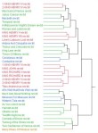


Now, what was initially obvious was that the different levels of analysis changed the diagram in different ways. The first set of images, that of Shakespeare’s canon, changed a lot more than the second set. As JMP analyzes data in terms of relationships between one point and another, it makes sense that a wider corpus means a more variation within the levels of analysis. However, the larger changes also made some interesting groupings that I didn’t look at quite as closely the first time around. The first picture shows relatively clean clusters of the Histories in Red, a mix of Comedies and Tragedies in Green, and the Late Plays in Blue, with Merry Wives of Windsor as an outlier. This morphs in the second picture when using Dimensions, as the major groups have splintered and have only left a group of most of the Histories in the middle. Merry Wives is still an outlier though, as evidenced by the only play with that color and by its relationship on the dendrogram or “twig” to the rest of the data. By the third picture, with the LAT analysis, a large part of the data set has been lost entirely, leaving most of the Histories and a little of the other groups. The removal of the part of the data was an unconscious choice by JMP and I could only speculate that what plays are in the image are, at heart, the plays that are the most “Shakespearean”. (however you define “Shakespearean” that is) The other plays must have been too far, statistically, from the locus of the data set and hence, irrelevant to a diagram of this level of analysis. I could partially base this off of the removal of Merry Wives, which was an outlier in the previous two diagrams and the significant change in the proportional distance between the individual twigs along the x-axis.
However, my theory of forcing these outliers to the very of edge of the diagram was tested after looking at the second set of data with King Lear and Cymbeline. In this data set, the initial diagram reveals a complicated relationship between the whole text (eg. “Cymbeline rev“) and when the acts are separated (eg. “CymbelineAct4“). This first picture shows a basic separation between the two groups, again making sense with two different plays. However, King Lear Act 5 clusters with the greater group of Cymbeline so much so that it is the same color and King Lear Act 1 forces Cymbeline Act 4 to also be an outlier. A large change happens again with the second picture, as both King Lear Act 1 and Act 5 come back to the larger King Lear cluster. However, they have brought Cymbeline Act 4 with them. But what really perplexed me was what arose in the third, fine-grained diagram. In it both plays have been cleanly separated, at least between themselves. But, not only have the outliers not been eliminated, they have been meshed with the larger group of their respective plays in a way that puts them closer to the focus than points without an outlier color scheme. This happens with both Cymbeline Act 4 and Act 2 as well as between King Lear Act 1, 5, and 3. Looking at all, there didn’t appear to be an end to the confusion between what seemed to be two separate plays, albeit by the same author.
This kind of messy data was both intriguing, but also inconclusive. Also with the second set in essence debunking my hypothesis of the first set, I didn’t think I could talk about it long at the conference. Early in the week I wasn’t happy with what I had sent in, but I had to let it ride due to other work. But it finally ate away at me until, at 11pm the night before the conference, I began a new project which I will explicate further in my next post.

Pingback: This Thing of Darkness (Part III) « All Is True